I recently come across Apple’s official SwiftUI tutorial: Apple Developer Documentation
And I think their UI/UX is great, they place screenshot and code on the right side of the screen, and tutorial text on the left, also there’s a preview on the top right corner that is “toggleable”.
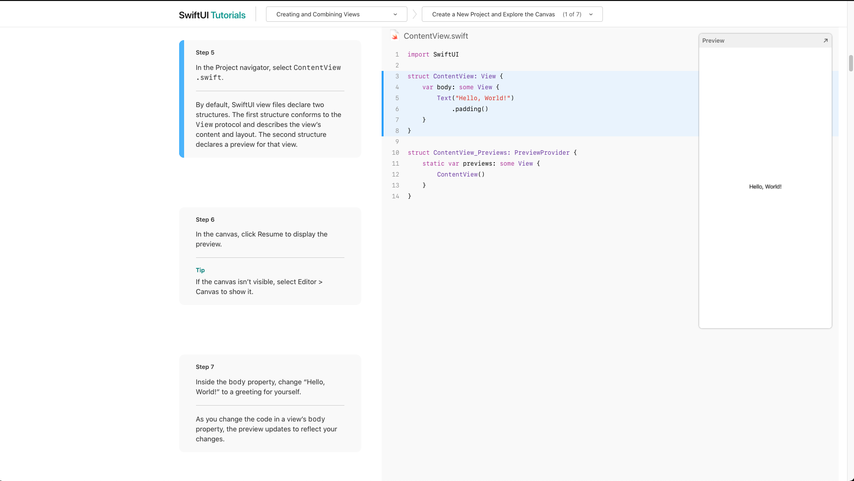
The always available code on the right side prevent the confusing of where the newly introduced code snippet should be added, which is a problem I faced on this site’s tutorial(very rarely though).
And I think placing screenshot on the right side can reduce the amount of scrolling when we need to view both the text and screenshot.
I think we can take insight from Apple’s style.