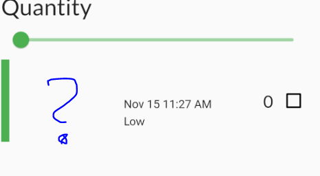
For some reason building the grocery tile I have this extra space on the left.
I have tried to debug it, but can’t see anything.
Grocery tile Row–
Container that is 10px to show the color. (That is working).
next is a SizedBox width of 16 (Space between the color bar and the next row of text).
On the Pixel 2 Emulator it looks wrong.
Here is the code:
@override
  Widget build(BuildContext context) {
    return SizedBox(
      height: 100.0,
      child: Row(
        mainAxisAlignment: MainAxisAlignment.spaceBetween,
        children: [
          Container(width: 5.0, color: item.color),
          const SizedBox(width: 16.0),
          Column(
            mainAxisAlignment: MainAxisAlignment.center,
            crossAxisAlignment: CrossAxisAlignment.start,
            children: [
              Text(
                item.name,
                style: GoogleFonts.lato(
                    decoration: textDecoration,
                    fontSize: 21.0,
                    fontWeight: FontWeight.bold),
              ),
              const SizedBox(height: 4.0),
              buildDate(),
              const SizedBox(
                height: 4.0,
              ),
              buildImportance(),
            ],
          ),
          Row(
            children: [
              Text(
                item.quantity.toString(),
                style: GoogleFonts.lato(
                    decoration: textDecoration, fontSize: 21.0),
              ),
              buildCheckbox(),
            ],
          ),
        ],
      ),
    );
  }