C3 “Stack View”, page 79. Point 7 says “Add a constraint that aligns the background view’s bottom edge greater than or equal to the superview’s Safe Area bottom edge with a zero constant.” This is apparently absolutely correct, but I don’t understand why. The desired behavior is for the bottom edge of the view to be just big enough for the view’s contents. Why is the constraint, then, not specified as less than or equal to? How could the view’s bottom edge ever be greater than the bottom edge of the superview? Help me to see this the way Auto Layout apparently does. Thanks!
Bumping my own post in hopes someone has a comment. Thanks!
@fischej Great question!
Perhaps an explanation with an image view can further clarify:
- Why the constraint is greater than or equal to?
- When a less than or equal to constraint becomes pragmatic?
Why the constraint is greater than or equal to?
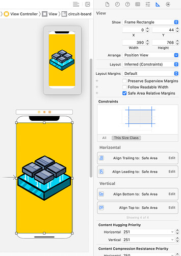
As an example, you have a UIImageView inside UIViewController in a storyboard.
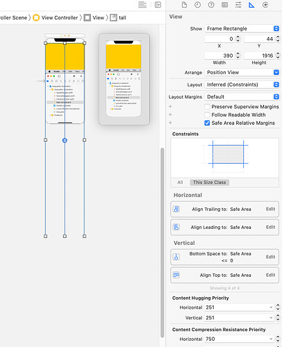
Here’s a set of leading, trailing, bottom and top equality constraints aligned to the view’s Safe Area edges with zero constants.
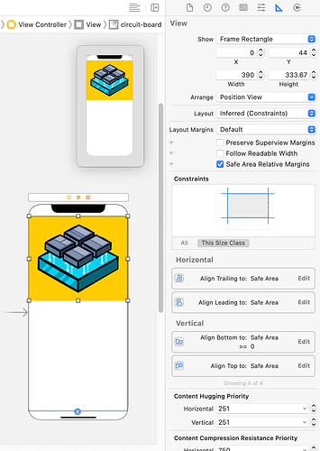
Here, the bottom constraint is set to greater or equal to zero.
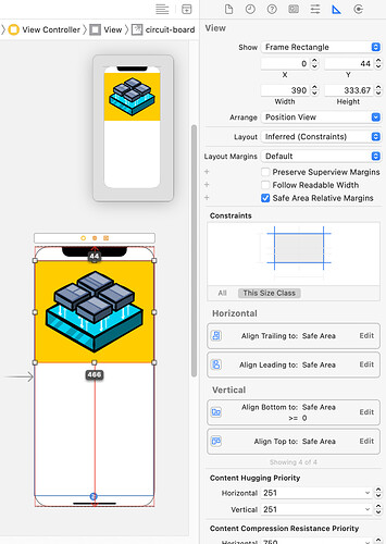
With the inequality constraint, the image view can be any number greater than zero. Here, the image view’s bottom edge is 466 points away from the superview’s bottom edge on an iPhone 11:
The purpose of the bottom inequality constraint has two main purposes:
- Allows the image view to grow/shrink without overflowing its superview’s bottom edge.
- Allows the image view to size according to the image view’s image aspect ratio.
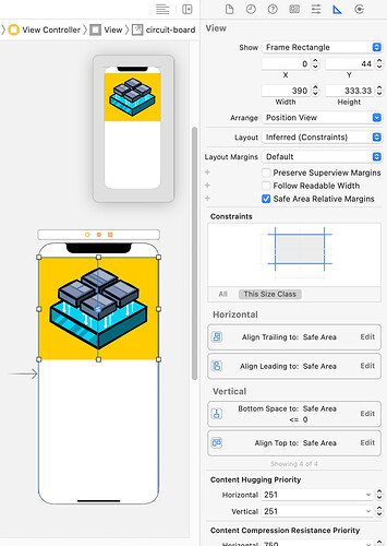
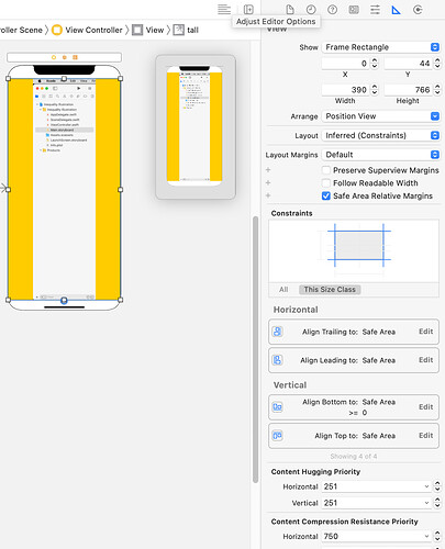
Another way to achieve purpose two is setting the image view’s bottom constraint to less than or equal to zero
However, a set of constraints like the above won’t respect the superview’s Safe Area bottom edge. This can be problematic when you have a tall image.
The resulting image view then looks like this:
Whereas a less than or equal to constraint on the image view’s Safe Area bottom edge to the superview’s bottom edge looks like this:
By having an less than or equal to bottom constraint, the image view’s frame grows/shrink dynamically and as needed while respecting the superview’s Safe Area bottom edge. This is helpful for the user interface’s layout to adapt to internal and external.
When a less than or equal to constraint becomes pragmatic?
If the project uses programatic constraints instead of storyboard for a better illustration of the fundamental constraint building blocks:
import UIKit

final class ViewController: UIViewController {
  // MARK: - Properties
  private let imageView: UIImageView = {
    let imageView = UIImageView()
    imageView.image = UIImage(named: "circuit-board")
    imageView.backgroundColor = .systemYellow
    imageView.translatesAutoresizingMaskIntoConstraints = false
    return imageView
  }()
  // MARK: - View Life Cycle
  override func viewDidLoad() {
    super.viewDidLoad()
    setupImageViewConstraints()
  }
  // MARK: - Constraints
  private func setupImageViewConstraints() {
    view.addSubview(imageView)
    NSLayoutConstraint.activate(
      [
        imageView.topAnchor.constraint(
          equalTo: view.safeAreaLayoutGuide.topAnchor),
        imageView.leadingAnchor.constraint(
          equalTo: view.safeAreaLayoutGuide.leadingAnchor),
        imageView.trailingAnchor.constraint(
          equalTo: view.safeAreaLayoutGuide.trailingAnchor),
        imageView.bottomAnchor.constraint(
          greaterThanOrEqualTo: view.safeAreaLayoutGuide.bottomAnchor)
      ]
    )
  }
}
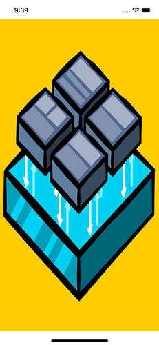
The resulting user interface looks as such:
Whereas this:
private func setupImageViewConstraints() {
  view.addSubview(imageView)
  NSLayoutConstraint.activate(
    [
      imageView.topAnchor.constraint(
        equalTo: view.safeAreaLayoutGuide.topAnchor),
      imageView.leadingAnchor.constraint(
        equalTo: view.safeAreaLayoutGuide.leadingAnchor),
      imageView.trailingAnchor.constraint(
        equalTo: view.safeAreaLayoutGuide.trailingAnchor),
      view.safeAreaLayoutGuide.bottomAnchor.constraint(
        greaterThanOrEqualTo: imageView.bottomAnchor)
    ]
  )
}
Or this:
private func setupImageViewConstraints() {
  view.addSubview(imageView)
  NSLayoutConstraint.activate(
    [
      imageView.topAnchor.constraint(
        equalTo: view.safeAreaLayoutGuide.topAnchor),
      imageView.leadingAnchor.constraint(
        equalTo: view.safeAreaLayoutGuide.leadingAnchor),
      imageView.trailingAnchor.constraint(
        equalTo: view.safeAreaLayoutGuide.trailingAnchor),
      imageView.bottomAnchor.constraint(
        lessThanOrEqualTo: view.safeAreaLayoutGuide.bottomAnchor)
    ]
  )
}
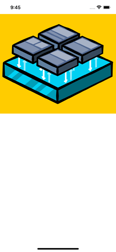
Results in the following layout:
The ordering of the view’s constraint matter.
imageView.bottomAnchor.constraint(
  greaterThanOrEqualTo: view.safeAreaLayoutGuide.bottomAnchor)
Versus:
view.safeAreaLayoutGuide.bottomAnchor.constraint(
  greaterThanOrEqualTo: imageView.bottomAnchor)
In addition, the following:
view.safeAreaLayoutGuide.bottomAnchor.constraint(
  greaterThanOrEqualTo: imageView.bottomAnchor)
Is equivalent to:
imageView.bottomAnchor.constraint(
  lessThanOrEqualTo: view.safeAreaLayoutGuide.bottomAnchor)
It’s like (A >= B) == (B <= A).
Or:
Thanks for question! :]
Wow, lots of good information there @jayvenn, thanks. After reading through all of your reply, I think now the part that confused me in the book was the way instruction 7 was worded: “Add a constraint that aligns the background view’s bottom edge greater than or equal to the superview’s Safe Area bottom edge…”. As you pointed out above, the order matters. In this case, it might be clearer to state it the other way around: “…aligns the superview’s Safe Area bottom edge greater than or equal to the background view’s bottom edge…”. This more clearly gives the correct order, and also aligns with the order of the resulting constraint in the Final version of the project (Safe Area.bottom ≥ View.bottom).
Thanks again for your reply!
